Happy Easter everyone.
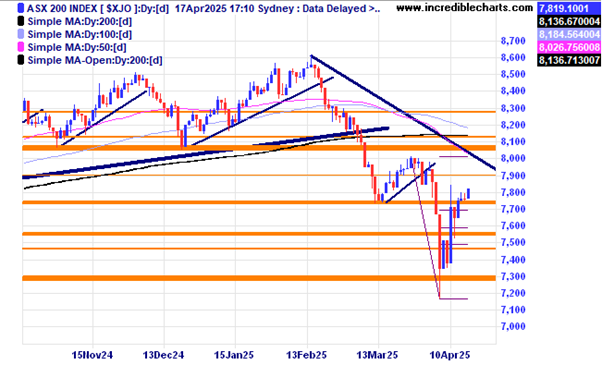
The local market could be seen as having made the low for now making a nice ABC type pattern down and we need a higher low to confirm a change of trend…. OR will it struggle at the trend line and moving averages making yet another lower high? Me thinks more trouble to the downside with the monetary impact of any implemented tariffs yet to materialise and the US consumer confidence very weak.
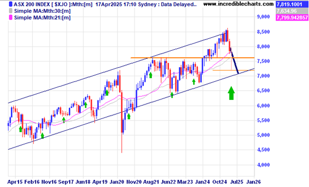
This monthly chart of the local index puts the big spike down into context over the longer term. Will that be the low for now or will we have an excursion lower to touch or even breach the lower trend line.
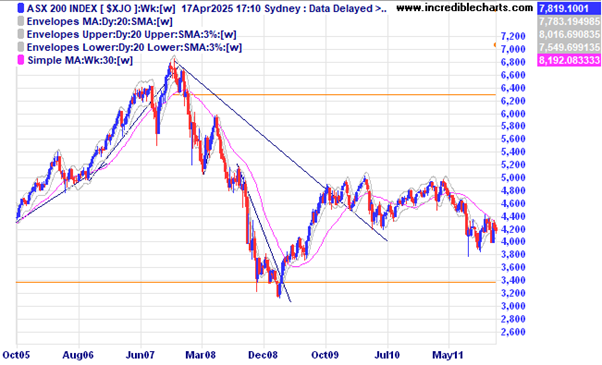
The last major grind down for the local index was back in the GFC days which saw one rally of 20 per cent give way to further lows and took well over a year to play out.
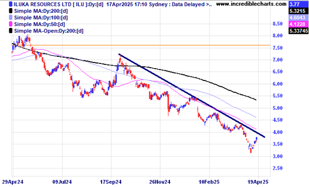
Iluka received a heap of monetary assistance from the Federal Government to help in building a rare earths plant in Australia. If they successfully get that up and running it could turn out to be another “investment” Albo and the team got right. Might help in dealing with the USA dramas as well. A move above the down trend line would be a good first step.
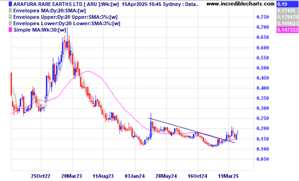
Another locally listed are earths hopeful is Arafura which has broken the trend line and so far has made a successful re-test.
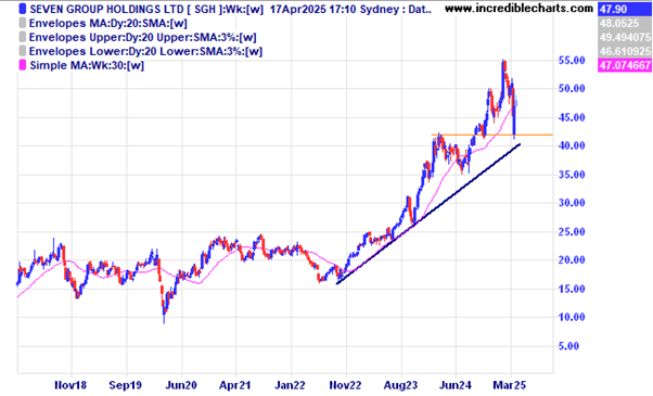
The gap between the trend line and the spike low could be seen as a sign of strength for Seven Group.
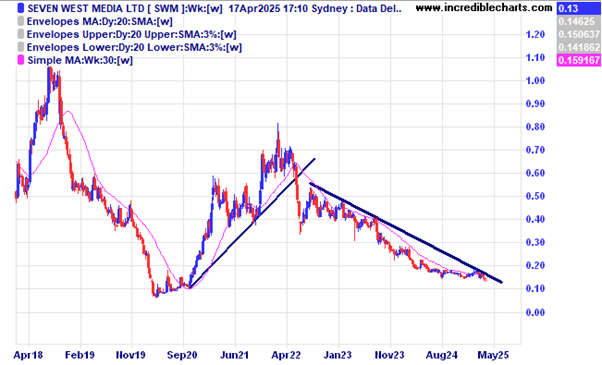
Seven West Media on the other hand looks like a basket case for now.
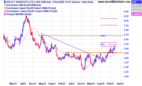
Select Harvest initially fell on the news of lower volumes and picked up later-on as thoughts on higher prices outweighed the volume issue.
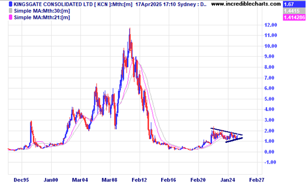
Gold miner Kingsgate Consolidated has recently re-started their mine in Thailand with mostly un-hedged production coming through. Be aware foreign country risk.
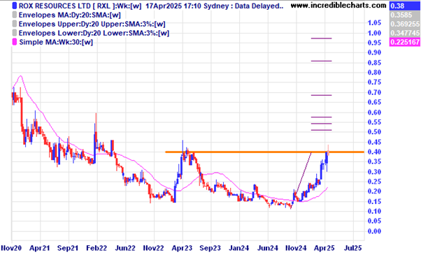
Small goldie Rox looks set to break out of this basing type pattern and is located in Australia.
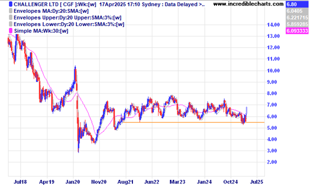
Challenger had a good day after releasing their latest results with annuity sales up.
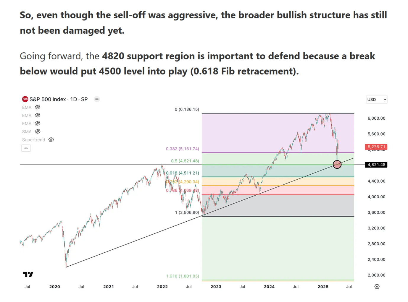
One analysts’ take on the current position of the US S@P 500 index. A broken rising trend line could see all bets off.
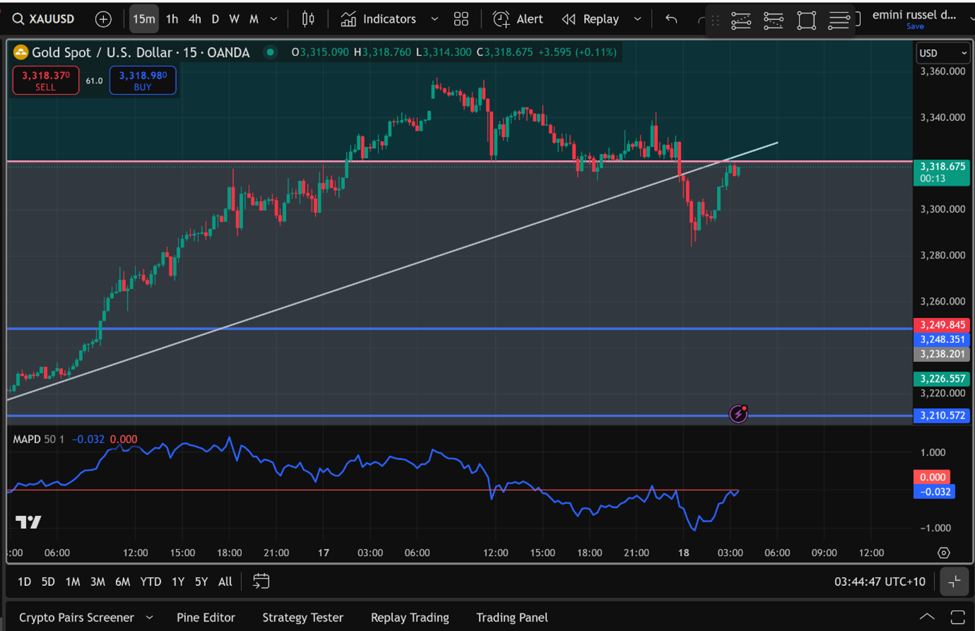
A current chart for gold on the 15minute time frame shows a classic trend line and support/resistance zone break down. With the current price of gold seen by many as a tad overbought a correction here could be seen as being very healthy for future upswings.
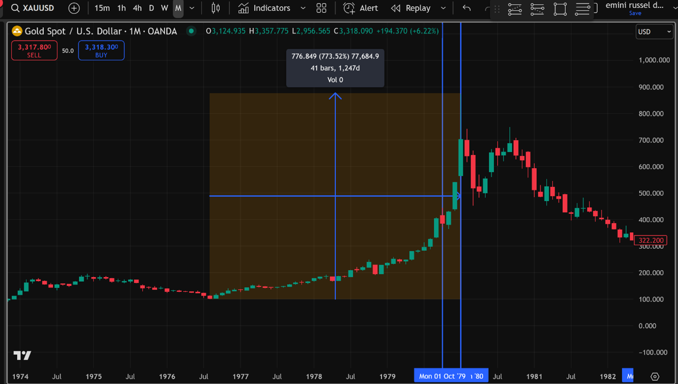
This series of charts shows the different outcomes of two previous bull markets in gold.
The first is the massive gold run in the late 1970’s and partly due to the Hunt brothers cornering the silver market which added some juice to the gold price, gaining 773 per cent from the low and a massive 8 times the price of the low.
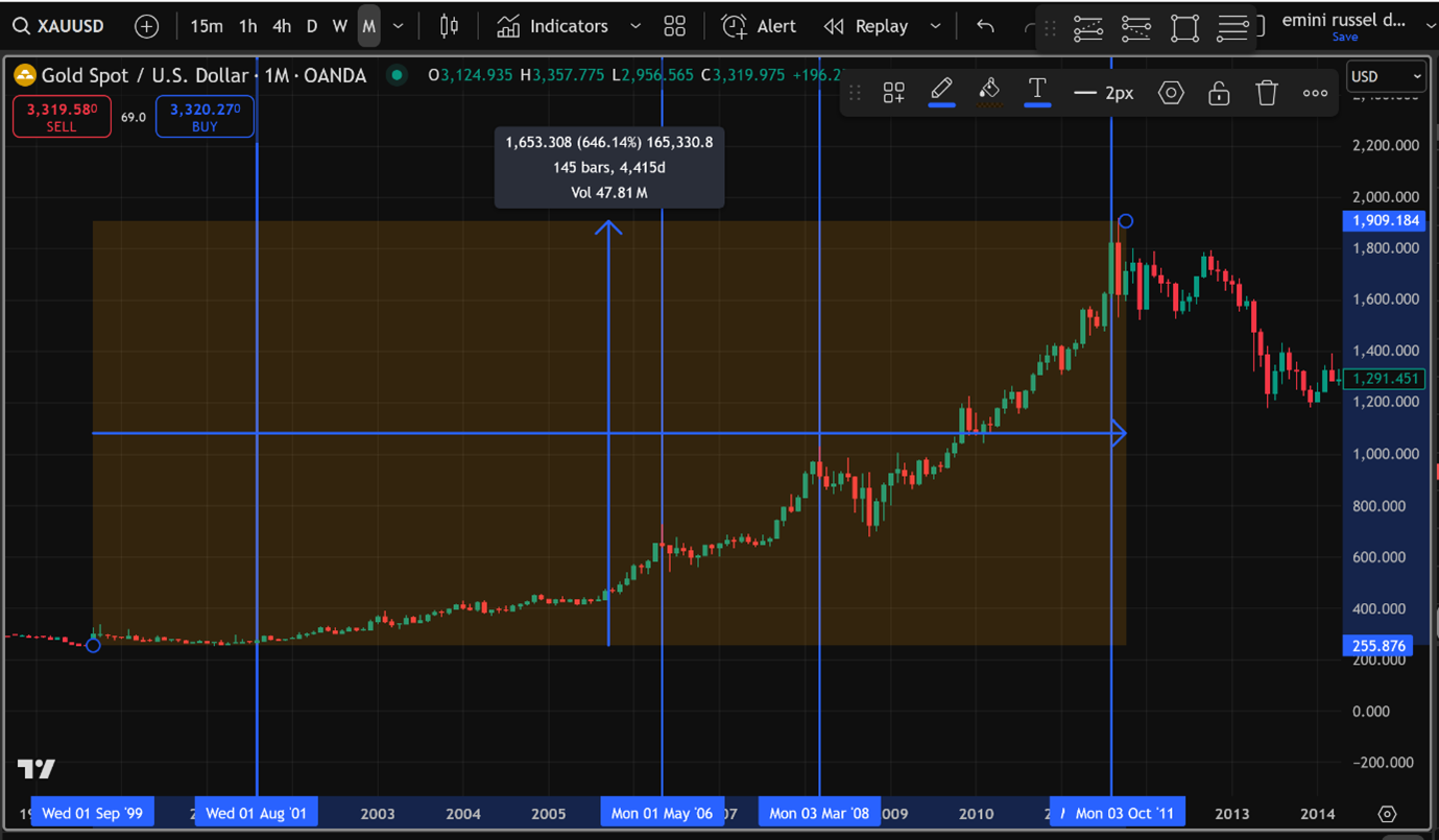
This shows the run up in gold from 2001 to 2011 and perhaps a flight to safety in the wake of the dot.com bust, a 6 bagger up 646 per cent and was up roughly 7.5 times the low.
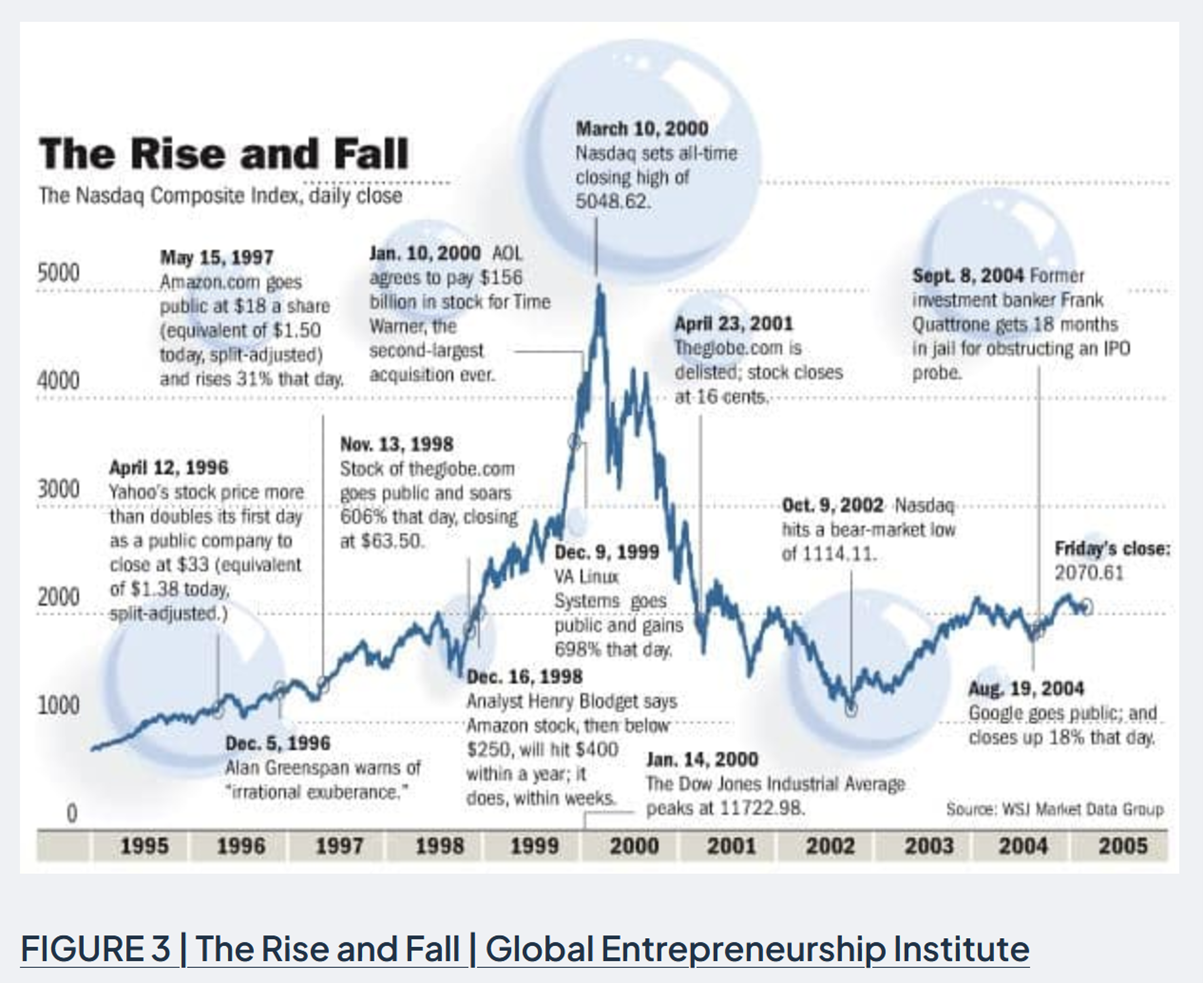
An interesting and informative graph of the dot.com boom and bust.
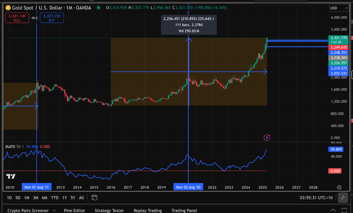
The latest run up in gold could go a lot further if it has a similar outcome to past bull markets. So far up 210 per cent and just over 3 times the price of the low. Seven times the low of $1060 gives around eight grand….. wouldn’t that be nice. Ohh… we’re half-way there…has a nice ring to it.
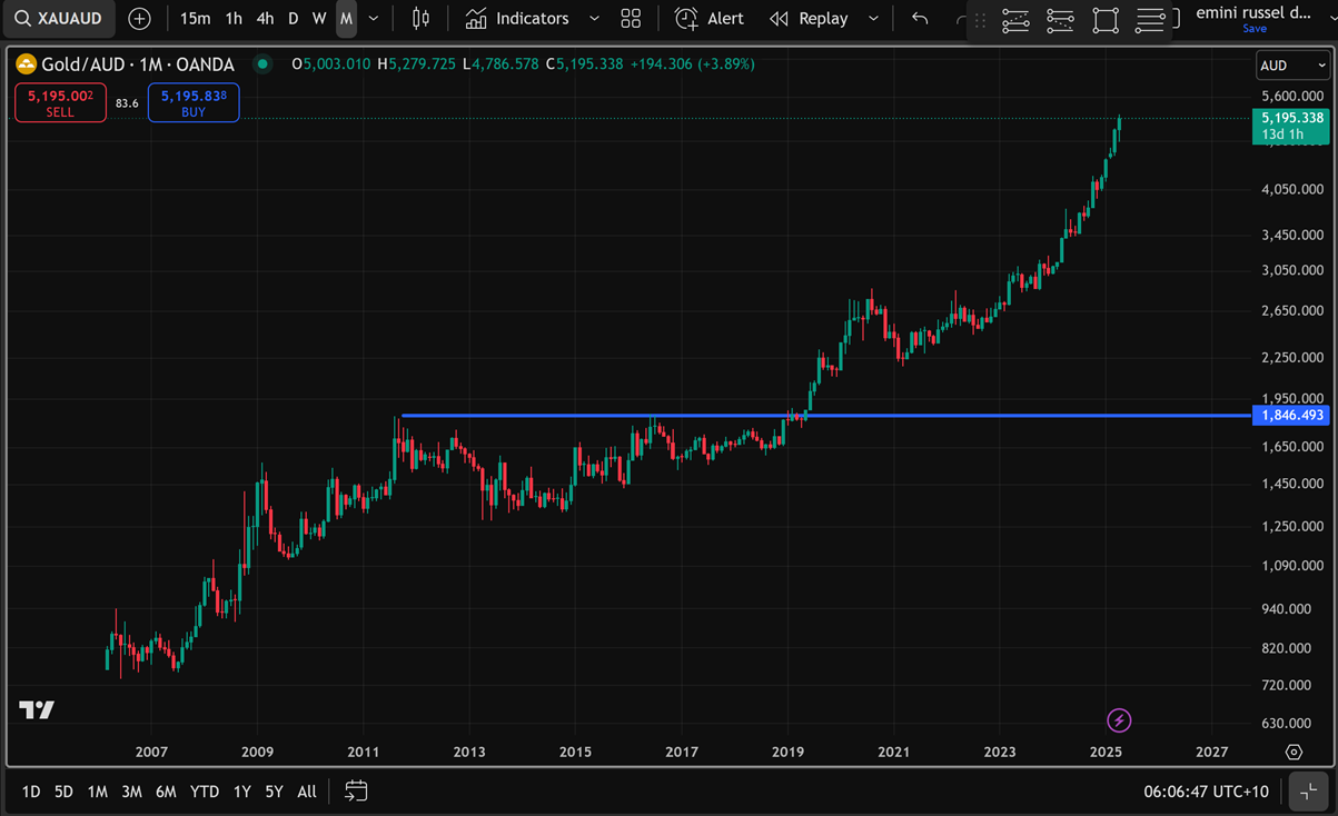
The price of gold in Australian dollars has been helped by the local currency heading south for a while.
Disclaimer: The commentary on different charts is for general information purposes only and is not an invitation to trade. Trading is risky and individuals should seek Professional counsel before making any financial decisions. Many thanks to Incredible Charts.com software for most of the charts used in the column. Cheers Charlie.
To order photos from this page click here


